Where to Put Reviews on Your Website: 8 Placements That Convert
Reviews buried on a testimonials page do almost nothing. Eight placements that put proof exactly where visitors hesitate, which layout suits each one, and the common mistakes to skip.
On this page
- Why does placement matter so much?
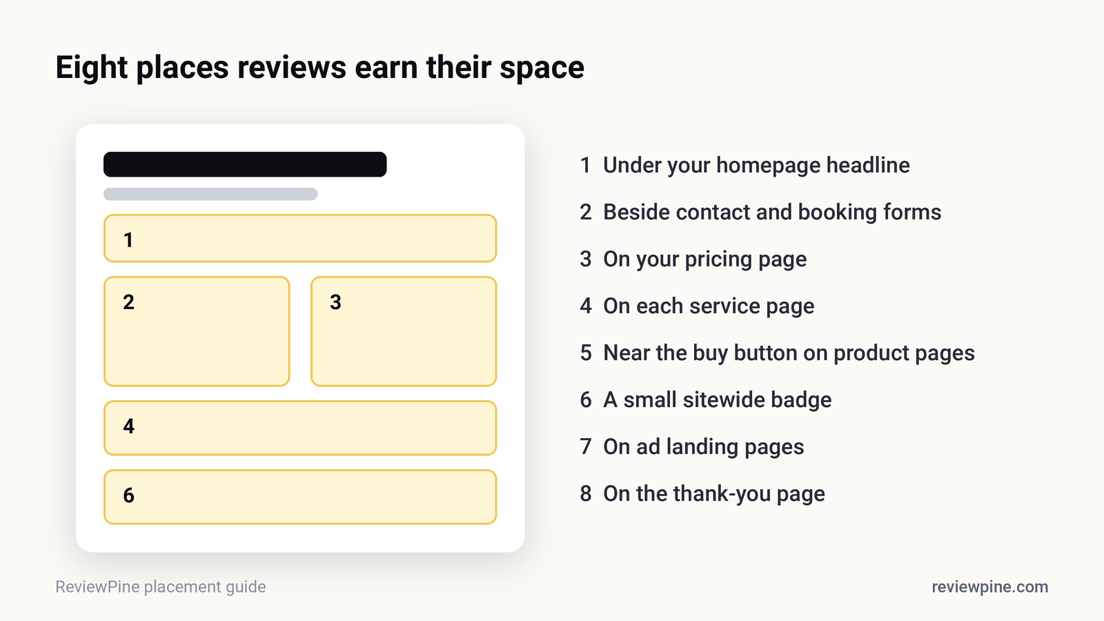
- 1. Directly under your homepage headline
- 2. Beside contact and booking forms
- 3. On your pricing page
- 4. On each service page
- 5. On product pages, near the buy button
- 6. A small sitewide badge
- 7. On landing pages for ads
- 8. On the thank-you page
- Which layout fits which spot?
- What are the most common placement mistakes?
- How many reviews should you show in one place?
- Should you show only five-star reviews?
- Put this into practice in one afternoon
Key takeaways
- Place reviews where visitors hesitate: under the homepage headline, beside forms, on pricing and service pages, near buy buttons.
- 54% of consumers visit a business's website after reading positive reviews (BrightLocal, 2026), looking for reassurance at each decision point.
- Match reviews to the page: service-specific reviews on service pages, value-focused reviews on pricing pages.
- Show a few relevant reviews near the action and more further down, always with your overall rating and count.
- Avoid hiding reviews on a separate testimonials page or only in the footer.
Put reviews where visitors hesitate: directly below your homepage headline, beside contact and booking forms, on pricing and service pages, and on product pages near the buy button. Reviews work best as an answer to a doubt at the exact moment the doubt appears, not collected on a separate testimonials page that few visitors open.
Here are the eight placements that consistently earn their space, with the widget layout that fits each one.
Why does placement matter so much?#
Because a review's job is to resolve a specific worry right before an action. "Will they turn up on time?" is a question someone asks while looking at your booking form, not while reading your About page. BrightLocal's 2026 survey found 54% of consumers visit a business's website after reading positive reviews. They arrive interested but not yet committed, and they look for reassurance near every decision point.
1. Directly under your homepage headline#
Your hero section makes a claim ("Fast, friendly AC repair in Pune"). The space right under it is where visitors decide whether to believe it. A slim row of three or four recent reviews, with your overall Google rating, turns the claim into evidence before anyone scrolls.
Best layout: a carousel or a compact header with your rating and star count.
2. Beside contact and booking forms#
This is the highest-stakes spot on most service websites. The visitor has nearly decided; the form is the last hurdle. Two or three short reviews about responsiveness and reliability, placed next to or above the form, answer "what happens after I press submit?"
Best layout: a vertical list or a sidebar of short reviews.
Tip: Choose reviews that mention the exact thing the form promises. Next to a "Get a quote" form, a review saying "they quoted within an hour and stuck to the price" does more than any generic praise.
3. On your pricing page#
Price is where doubt peaks. Reviews that mention value ("worth every rupee", "no hidden costs") placed near your prices reduce sticker shock and make the higher tier feel safer. Northwestern's Spiegel Research Center found reviews lift purchases more for higher-priced items, which is exactly the tension on a pricing page.
Best layout: a grid of three reviews beneath the price table.
4. On each service page#
If you offer several services, each page should show reviews about that service: kitchen renovation reviews on the kitchen page, bathroom reviews on the bathroom page. Relevance beats volume. A visitor considering a root canal wants to hear from other root-canal patients, not about teeth whitening.
Best layout: a carousel filtered to reviews mentioning the service, or a short list.
5. On product pages, near the buy button#
For e-commerce, reviews near the price and "Add to cart" are standard for a reason. For shops that also have a physical store or strong Google presence, your Google reviews about service and delivery reassure buyers about the shop itself, alongside product-specific reviews. See Google reviews on Shopify.
Best layout: a compact badge with your rating near the price, and a fuller grid lower on the page.
6. A small sitewide badge#
A discreet badge showing your Google rating and review count, in the footer or a corner, keeps social proof visible on every page without taking much space. It's especially useful on blog posts and informational pages where a full widget would feel out of place.
Best layout: a badge or a small floating sidebar.
7. On landing pages for ads#
If you pay for traffic, every visitor costs money. Ad landing pages should show reviews above the fold, because paid visitors are often colder than organic ones and need proof faster. Match the reviews to the ad's promise.
Best layout: a header with rating plus a carousel.
8. On the thank-you page#
After someone books, buys or enquires, the thank-you page is often wasted. For returning customers, it's a natural place for a "Write a review" button. For new customers, a few reviews reassure them they made a good choice.
Best layout: a short list with a "Write a review" button.
Which layout fits which spot?#
| Placement | Recommended layout | Number of reviews |
|---|---|---|
| Under the homepage headline | Carousel with rating header | 3 to 10, rotating |
| Next to contact or booking forms | List or sidebar | 2 to 4 |
| Pricing page | Grid | 3 to 6 |
| Service pages | Carousel or list, filtered | 3 to 6 |
| Product pages | Badge near price, grid lower down | Rating plus 3 to 6 |
| Sitewide | Badge | Rating and count only |
| Ad landing pages | Carousel with header | 3 to 6 |
| Thank-you page | List with "Write a review" | 2 to 3 |
You can see every layout working with real reviews in the ReviewPine widget gallery.
What are the most common placement mistakes?#
| Mistake | Why it hurts | Fix |
|---|---|---|
| Reviews only on a "Testimonials" page | Few visitors ever open it | Spread reviews across decision points |
| Reviews only in the footer | Seen after the decision, if at all | Move them next to calls to action |
| Old, undated reviews | Look stale or invented | Show recent Google reviews with dates |
| Huge wall of reviews above the fold | Pushes your offer and button down | A short carousel, with more lower down |
| Same reviews on every page | Wastes the chance to match each page's worry | Filter by service or theme |
How many reviews should you show in one place?#
Fewer than you think, near the decision, and more further down. Three relevant, recent reviews next to a form beat thirty generic ones. Use a carousel or "load more" for depth, so people who want to read further can, without pushing your main content away. Always show your overall rating and total count, so visitors know they're seeing a selection from a larger, real body of reviews.
Should you show only five-star reviews?#
You can feature your best reviews, but be honest about it. Show your overall Google rating and review count alongside the selection, and link to your full profile. That combination is both persuasive and transparent. Research from the Spiegel Research Center found buyers actually trust ratings between about 4.0 and 4.7 more than a perfect 5.0, so a believable mix is a strength, not a weakness. More in is a perfect 5-star rating bad for business?
Put this into practice in one afternoon#
- List your pages where visitors take action: home, contact, booking, pricing, top services.
- Add a review widget to each, choosing the layout from the table above.
- Filter reviews by topic where possible, so each page shows the most relevant ones.
- Check every placement on a phone, where most of your visitors are.
ReviewPine lets you create a separate widget for each placement, with its own layout, filters and pinned reviews, all fed from your live Google reviews. Change a design in the dashboard and every page updates instantly. Start with our guide to adding Google reviews to your website.
Frequently asked questions
Where is the best place to put reviews on a website?
Should I have a separate testimonials page?
How many reviews should I show on my homepage?
Should reviews go on every page?
Is it okay to show only positive reviews on my website?
Turn your Google reviews into your best salesperson
Show real, always-fresh Google reviews on any page of your website, with a "Write a review" button that brings in new ones. Set up in about two minutes.
- Works on WordPress, Shopify, Wix and any site
- Updates itself every day
- No cookies, no slowdown
Anjanee Shukla
Founder, Ainygo Technologies
Anjanee Shukla is the founder of Ainygo Technologies and has been working in the technology industry for over 15 years. He has helped businesses worldwide by developing more than 1,000 websites, web applications, and digital solutions. His expertise spans WordPress, web development, website maintenance, hosting, automation, and business technology. Through this blog, he shares practical advice, technical knowledge, and real-world solutions gained from years of hands-on experience.